Quantum—qprw


The visual identity design for the international communications agency, "Quantum QPRW," reflects a harmonious blend of dynamism, strength, and elegance, which mirrors the agency's multifaceted nature and global reach. With offices scattered across the continent, Quantum QPRW's identity needed to encapsulate its diverse portfolio and international presence. The carefully chosen color palette and typographic selection are pivotal in achieving this balance.
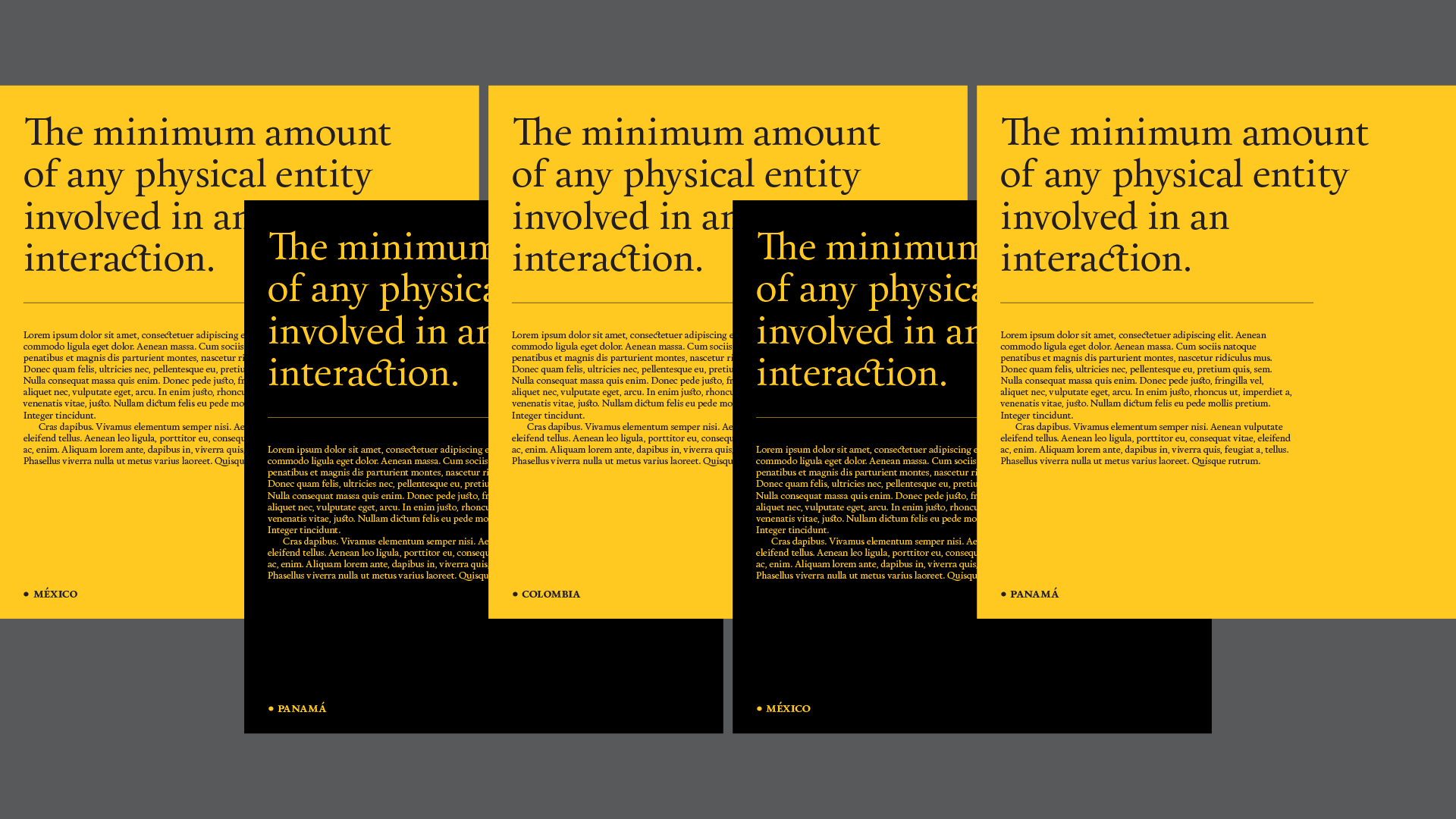



The vibrant colors employed in the visual identity evoke a sense of energy and innovation, showcasing Quantum QPRW as a dynamic player in the communications field.


At the same time, these colors exude strength and resilience, emphasizing the agency's commitment to delivering robust and effective solutions to its clients. The selection of the Spanish typeface Calendas Plus from Atipo adds an element of elegance, alluding to the sophistication and finesse with which Quantum QPRW approaches its work.


The fusion of these design elements results in an identity that not only captures the essence of Quantum QPRW but also underscores the global nature of its operations. It's a testament to how strategic visual identity design can effectively convey a brand's ethos, values, and aspirations while also paying homage to the creative talents of typographers like Atipo from Spain.


branding, web designLenny Maya